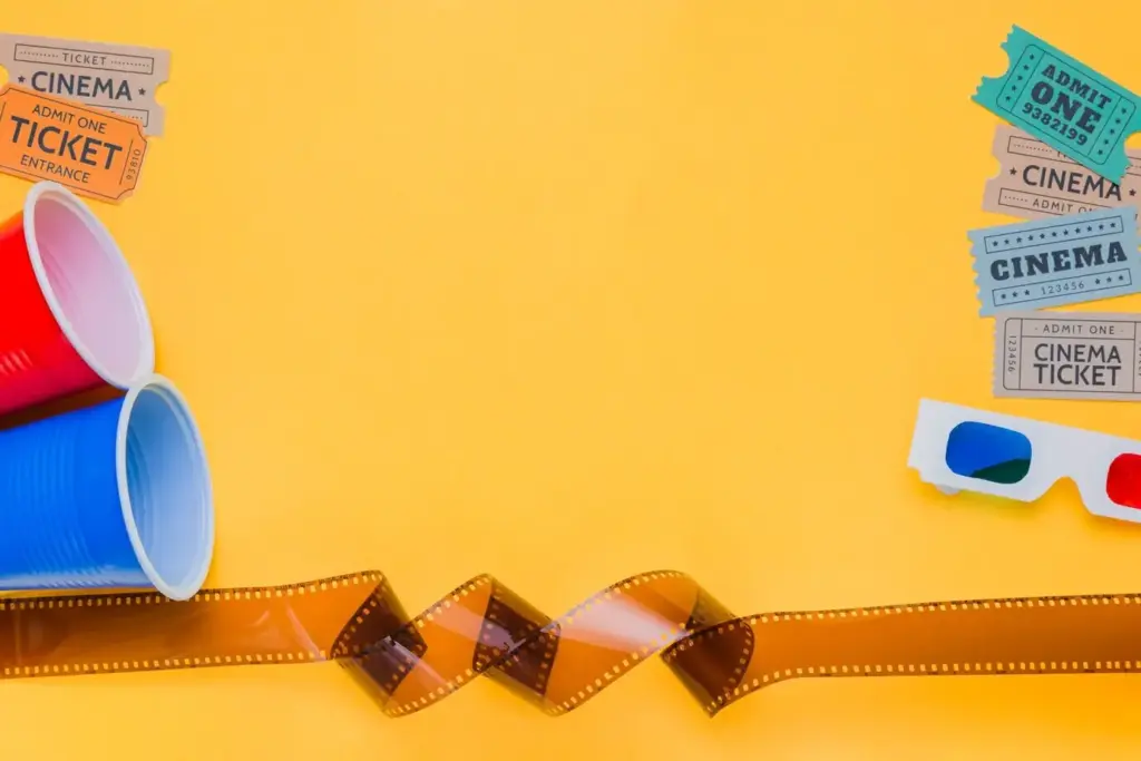
Opening Credits That Tell a Story
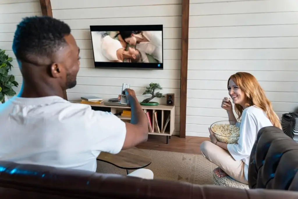
Today we dive into The Art of TV Title Sequences, celebrating how opening visuals and sound transform a simple credit list into mood, mythology, and momentum. From typography and music to metaphor and motion, discover the craft behind moments that prime curiosity, lodge in memory, and frame stories before a single scene begins.


A Brief History of Opening Credits
Before binge culture, credits were brief identification; earlier still, they were silent cards announcing performers. As technology advanced, studios experimented with animation, iconic logos, and montage. Understanding this evolution reveals why contemporary openings feel cinematic, purposeful, and emotionally charged, inviting viewers into worlds with style, confidence, and narrative intention.
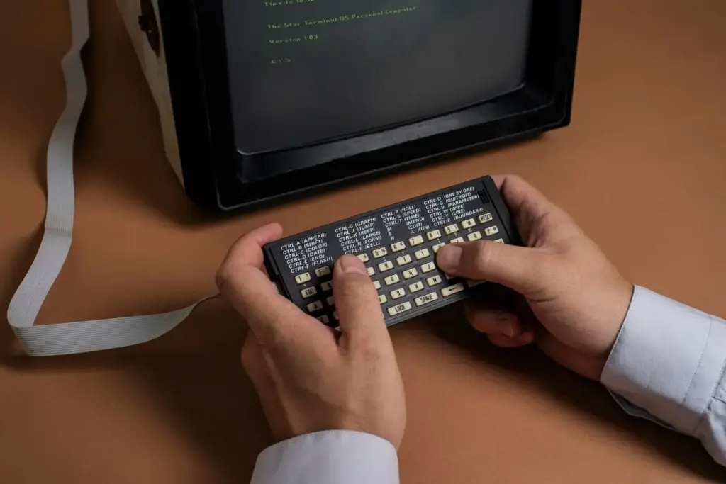
From Silent Cards to Studio Identities
Early television borrowed from theater and cinema intertitles, presenting names plainly while orchestras or organs supplied mood. Gradually, hand-painted art and optical tricks entered the frame, giving networks recognizable signatures. These seeds of identity paved the way for bolder experimentation and the expectation that credits could entertain.
The Golden Age of Network Branding
With limited channels competing nightly, networks invested in memorable stings, rotating idents, and unified palettes. Title sequences introduced not only shows but brand promises: reliability, glamour, or innovation. These strategies taught audiences to trust certain rhythms, colors, and sonic cues long before a plot even unfolded.
Prestige TV and the Cinematic Turn
Cable freedom and streaming budgets encouraged cinematic ambition. Designers collaborated with directors, cinematographers, and composers to build mini-films that encapsulate conflicts, settings, and tone. Audiences learned to expect layered symbolism, textured soundscapes, and evolving details that reward rewatching long after familiarity with cast and premise sets in.
Design Principles That Hook Viewers
{{SECTION_SUBTITLE}}
Typography with Character
Letterforms carry voice. Slab serifs promise grounded grit, while razor-thin sans-serifs whisper sleek menace. Kerned meticulously, animated thoughtfully, type can behave like a character: entering late, shuddering with fear, or stretching with arrogance. When executed precisely, typography becomes memory glue, connecting names to mood with irresistible authority.

Color, Texture, and Mood
Palette choices prime emotion instantly. Smoky blues and desaturated metals suggest procedural cool; saturated neons crackle with nostalgia or danger. Grain, film burn, and digital noise evoke era and texture, guiding expectations. Combined with lighting and motion blur, color theory becomes storytelling, deepening resonance before the first line lands.
Music and Sound That Set the Tone
Sound completes the spell. A few notes can signal melancholy, menace, or mischief and stay lodged for years. We consider instrumentation, tempo, and mix choices that make titles rewatchable, and how sonic branding stitches coherence across seasons, spinoffs, and trailers without feeling repetitive or emotionally manipulative.
Symbols, Metaphors, and Foreshadowing
A well-placed object—a cracked crown, a blooming bruise, a frayed ribbon—suggests stakes more efficiently than dialogue. Repetition across episodes turns imagery into prophecy. By modulating clarity, artists invite interpretation, letting fans debate meanings, share screenshots, and build community while the narrative slowly confirms or subverts their hunches.
Character and Place in a Montage
Title sequences can sketch personalities through gesture, wardrobe, and micro-environments, while cities and landscapes assume character status through aerial sweeps and tactile close-ups. Juxtaposing intimate details with grand vistas suggests scale and vulnerability, readying viewers to hold both in mind as complications arrive and alliances shift.
Evolving Credits That Reward Rewatching
When design teams update openings with new clues—altered props, weathered textures, surprising names—viewers feel respected and engaged. Subtle changes can reflect character growth or deteriorating stability. Social feeds ignite with analysis, which deepens identification and keeps audiences returning early instead of skipping to cold opens.
Case Studies Worth Rewinding
We revisit beloved sequences to uncover decisions that made them unforgettable while acknowledging tastes differ. Examining structure, type, and music helps decode why certain openings become appointment viewing. Share your favorite examples in the comments, and tell us which details you noticed only after the third or fourth watch.
Game of Thrones: Mapping Power and Promise
A clockwork map constructs continents before our eyes, prioritizing locations relevant to each episode. Brass timbres and mechanical clicks bind exploration to destiny. The evolving model taught viewers to read geography as strategy, compressing politics into gears, levers, and looming names that foreshadow shifting allegiances.
True Detective: Layered Souls and Southern Grit
Double exposures stitch faces with refineries and highways, creating liminal ghosts of memory and place. A gospel-blues lament grinds under dusted textures. The sequence promises intimacy and corruption intertwined, suggesting that landscape imprints on conscience, while trauma edits perception, and truth arrives in fragments more than declarations.
Practical Workflow and Collaboration
Behind the magic lies disciplined process. Clear briefs define constraints, references guide tone, and prototypes expose pacing issues early. We discuss tools, schedules, and communication rituals that empower teams to deliver iconic sequences on time, while welcoming feedback, inviting audience conversation, and encouraging subscriptions for future deep dives.
Briefs, Moodboards, and Creative Alignment
Strong beginnings prevent expensive detours. A concise problem statement, clarified audience, and measurable goals establish direction. Moodboards and swipe files create a shared visual dictionary, ensuring stakeholders evaluate intent rather than personal taste. Alignment early gives designers courage to explore, and producers confidence to defend surprising choices.

Prototyping with Motion Tests
Short animatics reveal timing pitfalls, strobing hazards, and legibility issues before resources commit. Testing type at multiple distances and devices protects accessibility. Iterating transitions alongside temp music exposes opportunities for syncopation and breath, transforming placeholders into proof that story beats land and emotion rises predictably and powerfully.